Telling Stories, Connecting Communities

Tag: West Georgia Textile Heritage Trail

My Journey Into Mapping

Author: Jessica Sinel

As an undergraduate research assistant, I was tasked to create maps to visualize the West Georgia Textile Heritage Trail during the Fall 2020 and Spring 2021 semesters for the Center of Public History. This project allowed me to gain further knowledge of working with Geographic Information Systems (GIS) and working with mapping programs such as ArcMap and ArcGIS Pro. This feature story will focus on my work in creating maps for the Textile Heritage Trail.

Before maps could be created, the raw data from the Davison Blue Book had to be organized for ArcMap to work correctly. With the help of Dr. Andy Walter from the Geoscience department, and Jamie Bynum, we organized the data by year from 1870-1976, and we listed each city’s (from Columbus to Dalton) number of mills, type of product produced, and nonlocal owners. We then focused our attention on the number of mills, so we made a dataset with every city on the Textile Trail, and the number of mills for each city from 1870-1976. Dr. Walter included latitude and longitude of each city so that the cities can be mapped with the location of each city. After the data was organized, we then familiarized ourselves with the new dataset by creating charts and graphs of the data to give us an idea of what the data looks like. After getting a feel for the data, it was time to start creating maps for the number of mills.

Dr. Walter showed me how to add the data into ArcMap, and I started working on mapping the number of mills from 1870-1976. I first started with how the map was going to look such as the layout, style, color, symbols, labels, font sizes, etc. The look and details of the map can be changed throughout the course of creating the maps, which I will talk more about later in this blog. I created a map for each year to show the number of mills for each city and the total number of mills in operation for that year. The maps displayed roads including freeways and highways, rivers, and railroads to illustrate how each city might have used the roads, rivers, or railroads to transport the products into the mills. I also created maps that showed different time periods, such as one map for the number of mills between 1870-1928, another between 1929-1957, and another between 1958-1976. After creating the number of mills maps and revising the look of them, I went to work on animating the number of mills in a map.

Animating a map was a new learning experience for me because I have not done one in any of my GIS classes. Animating a map allows the reader to see changes in the data as it moves through time in either seconds, days, months, years, or decades. It took me a week to learn how it works and how to create a time animation for the number of mills. The data does not have every year between 1870-1976, and because the years are irregular, animating the map is a little more difficult. ArcMap can animate a map, but its animation is basic and relies on data for every year with no gaps. Because the years in the data has gaps, ArcMap would not work for this project. I had to learn a whole new program, ArcGIS Pro, to be able to animate the number of mills. ArcGIS Pro can animate both regular and irregular time intervals, and can add titles, texts, and images to the animated map. I have not used ArcGIS Pro until this project, so this was also a new learning experience for me. After two weeks of familiarizing myself with ArcGIS Pro, I was able to create a time animation for the number of mills from 1870-1976. It took me several attempts to get the animation looking how I wanted it to look.

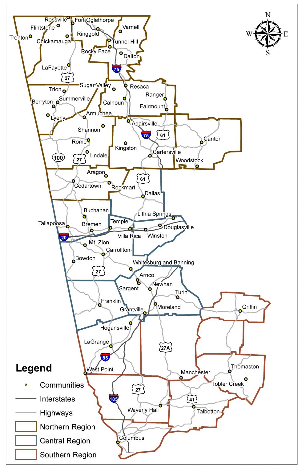
After the number of mills were mapped, I then focused my attention on the non-local owners. The data for the non-local owners contained the city and state that the owner was living in while owning a mill(s). The city’s location of the non-local owners then had to have coordinates in order for the owners’ location to be mapped, so I used Google Earth to help get coordinates for each city. The location of owners can now be mapped. I used ArcGIS Pro to create these maps. I created flow maps, which is lines from a starting location (like the regions used in these maps) to the owners’ locations. I separated the maps into four time periods and separated them into three regions (Northern, Central, and Southern). I created buffers with these maps to show how far away the owners were from the mill’s region. The buffers included 100, 500, and 1,000 miles from the center and included percentages of the owners located within each buffer. It is a good way to show how the non-local owners’ range widely and how most of the owners were in the northeast region of the U.S. Since these maps can be sometimes confusing, I created an interactive map of the owner’s location so that you can turn on and off years and regions so you can see the owners in your own way. The interactive map does start with no layers displayed so that you are not overwhelmed with the information to start with. The interactive map can be found here:

https://uwg.maps.arcgis.com/apps/instant/interactivelegend/index.html?appid=4294b64dff254ea3886f99b3a44686b6.

After the non-local owners were mapped, I then turned my attention to the product types that were produced in each town. The data for the product types included cotton, woolen, dryers & finishers, knit goods, rayon & silk, jute, synthetic, cordage, printing, and cord., twist & duck. I then mapped the product types using ArcGIS Pro, and I created pie charts to show the amount of each product type on the map. I started with mapping the product types in each region (the towns in each region were combined) over three time periods, 1870-1928, 1929-1957, and 1958-1976 and they also included the number of mills in each region. These maps also contain a table of the percentages of each product type which corresponds to the pie charts on the map. I then created maps of the product types in each town using the same three time periods. The results of these product type maps show that the early years mostly had cotton and slowly over time had a wider variety of different types of product. I was also able to create a time animation map for the product types produced in each town so you can see the changes of product types produced over time.

Getting the details in a map can be time consuming and can take days or even weeks to get the exact color, style, or layout just right. For a map to look professional, time must be taken to make it look professional. There can be several things that can make the difference between a professional looking map and a poorly looking map such as: is the map balanced, are the colors balanced with the rest of the map (is it too bright, or too dark), are the labels for each city in the correct location and not overlapping with other cities and symbols, are the symbols big enough to see, is the data accurate in the map, etc. There are many other things that can go into the details in a map. The maps need to have a professional layout so everyone can read and understand the maps, no matter how experienced they are with reading maps. This was important to me in creating maps for the Textile Trail because I want the maps to look as professional as possible so that everyone can read and understand the maps that I have created for the Textile Trail.

I learned so much from the West Georgia Textile Heritage Trail project these semesters. I not only learned to organized raw data, create new maps, and create a time animation map for the number of mills from 1870-1976, but I also learned the history of the textile industry in West Georgia. You can learn so much more working with a project compared to what you can learn in a classroom. I was able to take the knowledge that I learned in the classroom, expand upon it, and apply it to a real-world project. I also learned that visualizing data could have endless possibilities. I would like to thank Dr. Andy Walter, Dr. Ann McCleary, and Keri Adams for giving me this amazing opportunity to work with the West Georgia Textile Heritage Trail project.

Textile Talk

Author: Brandon Cohran

A new year ushers in new changes, and for us at the Center for Public History at the University of West Georgia, we are making changes as well. Beginning this month, we are looking to bring unique and diverse blog posts to the website in order to offer fun, new, and interesting perspectives about the West Georgia Textile Heritage Trail. As a new graduate research assistant, and the Textile Heritage Trail Curator, I am ecstatic about the Textile Trail project and all of the potential stories and experiences that will come out of this ongoing documentation of regional history.

What is the Textile Heritage Trail, you ask? Why does it matter? Well, the West Georgia Textile Heritage Trail, or Textile Trail, is a research project conducted by students and History Department faculty in the Center of Public History at the University of West Georgia. The Textile Trail is a heritage tourism initiative, whose shared history is curated and researched by students in order to tell the stories of communities throughout northwest Georgia. The Trail spans from Dalton to Columbus, Georgia, along the U.S.Highway 27 corridor, and focuses on this region from antebellum to the present day, while telling the history of the textile industry in the region. The textile industry built small Georgia towns and cities during this period.

Photo of the 1904 Chattooga County Fair in Summerville
Product showcase at the Goodyear Tire Plant in Cedartown, Georgia, 1950s. Courtesy of Polk County Historical Society.

Textiles, such as, cotton mills and hosiery mills, as well as chenille, carpet, apparel and garments, led to the manufacturing of rubber wire and tire cord for automobiles. The textile industry throughout central and northwest Georgia, created economic growth and stability, which led to a strengthened infrastructure for small towns along railroads and rivers.

Foundations of the Textile Trail began long before its founding in 2012. It started with the work of History students and  faculty that conducted research and oral history projects in proximity to the University of West Georgia in the early 2000s. The first wave of research was an indication of the importance that textiles, primarily cotton, had on the growth of various communities in size and in the economic stability in the Carrollton area. In the spring of 2012, the Textile Heritage Trail became a Center-based project that utilized student work every semester. The years of research and labor became a centralized focus of the Center, and through all of the past and present work, each year new discoveries help us to update our information about the communities along the Trail in addition to creating new entries.

The next milestone for the Textile Heritage Trail came in 2013 in thanks to a grant that the Center received from the Callaway Foundation of LaGrange, Georgia. History student researchers and faculty embarked on new research and image collecting leading to the Trail’s first guidebook, The West Georgia Textile Heritage Trail published as a part of Arcadia Publishing’s Images of America series in December 2015. The Center, through the book project, was able to develop deeper stories and to form stronger community connections to the textile industry. We use our website, self-guided walking tour brochures, and interpretive signs to tell these stories.

Our current student-staff working on the Textile Heritage Trail consists of three graduate research assistants, one of which has worked the project since the fall of 2014. Together it is our mission, I feel, to provide enriching stories, educational information, and to give exposure to the diverse range of people whose lives changed because of the Textile Trail throughout north and west Georgia. My two project team members are Chanell Lowery and Emily Harrington. They both contribute heavily to the success of the project along with myself, Brandon Cohran.

Emily Harrington, our Strategic Planning Coordinator for the West Georgia Textile Heritage Trail Project, is in her second consecutive semester being involved on the Textile Trail as a Graduate Research Assistant. This new planning initiative is generously funded by the Callaway Foundation of LaGrange, Georgia.  Emily said that she “has enjoyed [her] time working on the Trail. It has had its challenges along the way but those challenges have been great learning opportunities for me.” She acknowledges that, “the future is sure to bring some great changes for us due to sticking with our strategic plan to incorporate future improvements to the Textile Trail.”

My other peer, Chanell Lowery, has been involved with the Trail project for over three years now, and with that, she has fulfilled many roles. Currently, however, she is working the completion of the Bowdon Spur Project (and leading the tour for it), while also transitioning digital databases, completing membership signs, and finishing newsletters and community brochures. Her experience with so many aspects to the Trail helps to keep the project organized and intact. The project touched home with Chanell, as she said, “when I started working on the Trail three years ago, I thought my work would be about helping others learn about their heritage, but it turns out I ended up learning about mine too. Last year, I learned that my  great-great-grandmother, Dora Lively, worked at Callaway mills.”

In addition to the dedicated work that both my colleagues Emily and Chanell do for the project, I am the new Curator for the West Georgia Textile Heritage Trail. So far, my contribution to the project has included the development of this blog, but also community research for the entries on the website and compiling new community histories to explore. I hope that these entries will not only be informational about the Textile Trail Industry in the area, but that the region’s past will connect to the present. My goal is to have the website community pages, and the blogs, be informational and unique. In my limited exposure to the Trail, so far, I have seen how important the textile industry was to the development and stability of small communities all throughout Georgia.

Two Chenille Spreads depicting peacocks outside of Prater's Mill
Chenille bedspreads on display at Prater’s Store, Dalton, Georgia. These two bedspreads feature colorful peacocks,  an iconic theme of the Old Dixie Highway chenille shacks in the mid-20th century. Courtesy of Janet Cochran.

To compliment the information on the Textile Heritage Trail website about the community’s textile history, we also include places to visit and activities to do when in the surrounding area. This added dynamic helps highlight the lasting impact that the Textile Trail had on the communities and people in the decades following the decline of the industry. Many, but not all, of the sites listed as places to visit display textiles or give their community’s narration of the impact that the textile industry left on the people who lived there.

The Textile Heritage Trail focuses on the people who lived in communities along the Trail and how their lives changed due to the textile industry throughout Georgia. I find it exciting that we, the current student-staff of the Center for Public History, continue to discover and tell the amazing stories of these people. Moving forward with this blog, I hope to focus on one key element or group of people every month, so that we, at the Center for Public History, can continue to grow and expand on the variety of ways that the Textile Heritage Trail influenced the people of Georgia.

A special thanks goes out to all of the previous students who have worked on this project along with my current team members Emily Harrington and Chanell Lowery. In addition, a thank you to the Center faculty Drs. Julia Brock and Ann McCleary, and Keri Adams.  

css.php