Telling Stories, Connecting Communities

Tag: mapping

Visualizing Data

Author: Tennesse Mena

In the Spring of 2022, I commenced my work in the West Georgia Textile Heritage Trail project with the guidance of Dr. Andy Walter, Dr. Ann McCleary and Keri Adams. I began with making visual representations of the number of mills throughout the years of 1870 to 1976 of a few of the communities within the region of West Georgia and eventually made graphs of each community represented. These visual representations were in the form of bar graphs and culminated into a 3-D model graph which portrayed the number of mills throughout the years and compared them to all other communities within the research region.

It is amazing to see a visual rendition of the dataset as it portrays the history of the textile mills in West Georgia. It is interesting to see the decline of textile mills that some communities have experienced and the increase that others have gone through. What would be fascinating to see is the Gross Domestic Product (GDP) of the cities compared to the number of textile mills throughout the years and if there is a correlation between GDP and number of textile mills. Another worthwhile project to undertake would be the representation of women owned textile mills in West Georgia, if there is any, and their stories. 

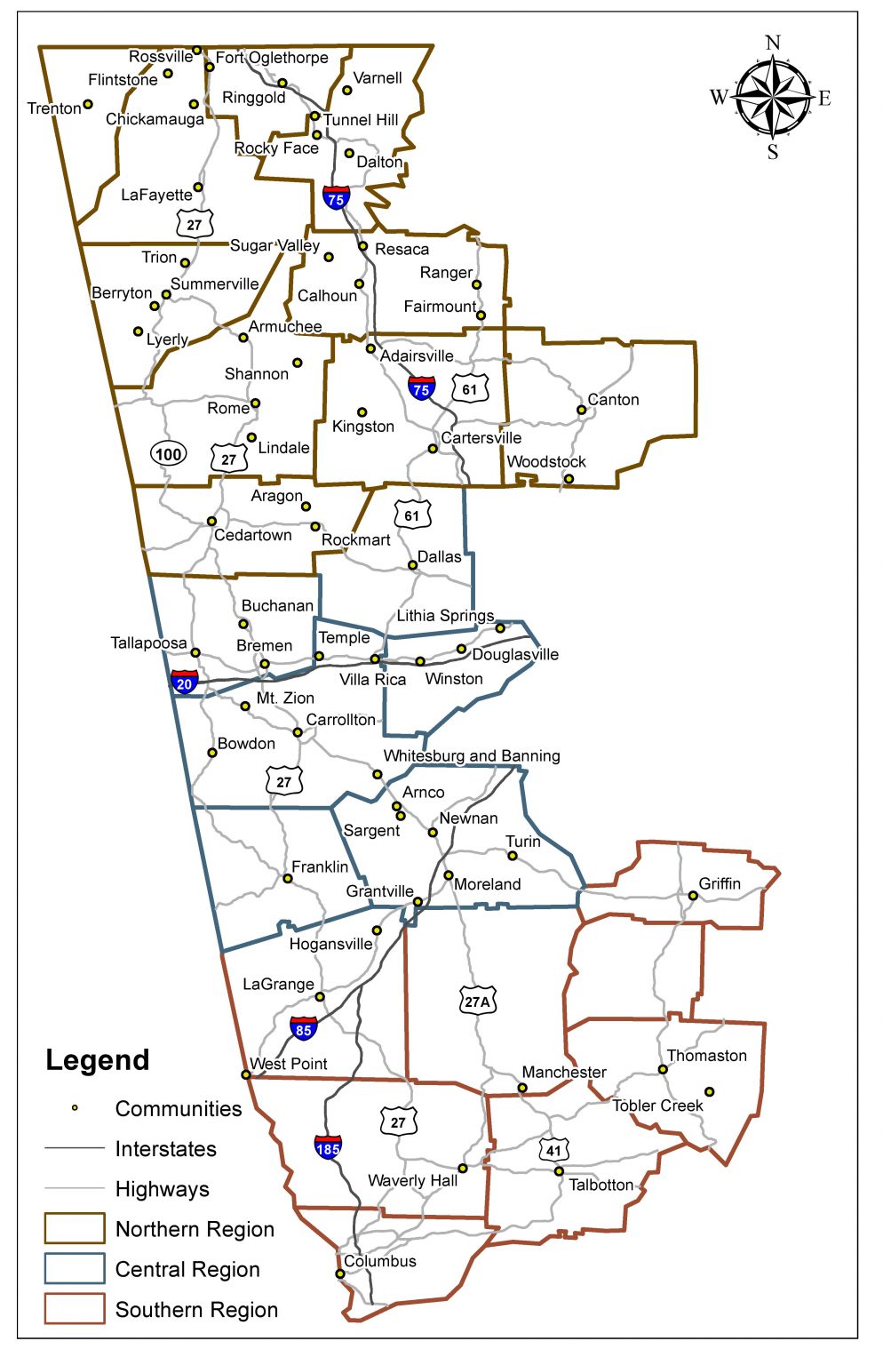
As the semester progressed, I started mapping out the West Georgia region using Quantum GIS (QGIS). QGIS is a free to use and open source mapping software that offers a wide range of data editing and mapping features. This allowed me to learn more about the program and I delved into refreshing my memory of mapping and QGIS as well as learning new things about the program and how to produce an end result that is both visually pleasing as well as easy to read and understand. When making a map, or any other visual representation of data, one must always keep in mind the viewing audience and cater to them, making it intriguing, informative, and readable. Throughout my time spent graphing, mapping and collaborating with others, I was able to learn so many valuable skills that I will take with me for my future professional endeavors.

All of my work throughout the semester culminated into the Scholars’ Day end results seen below. Scholars’ Day is sponsored by the Honors College and the Office of Undergraduate Research. It is a day in which undergraduate students present their research projects in the form of an oral presentation, poster presentation (which is what I did), visual arts presentation, or a performance presentation. It tells the story of the economic flow of the West Georgia textile industry. As we can see, nonlocal investment steadily increased throughout the years, first seen with the nonlocal ownership in Massachusetts. This then spread to regions on the east coast but there were even nonlocal investments in both California and Arizona in later years. It is amazing to see the changes throughout the years and how it has shaped these communities into what they are today. 

Scholars’ Day was a great experience as I was able to put my presentation skills on display. Of course I was nervous at first but after presenting my project over and over again, I was able to lose my nervousness and perfect my presentation along the way. This was great exposure for my future endeavors and I truly did learn from my experience at Scholars’ day. There were some great suggestions from the audience at Scholars’ day, one of which resonated with me. Someone in the nursing profession suggested seeing the correlation of cancer rates within these communities compared to others that are not around textile mills. This could be a possible project undertaken in the coming semester or in the future.

Slideshow of Maps:

These graphs were very enlightening and show how visual representation can contribute so much to understanding a topic. They are also very easy to read and understand so that it reaches a wider range of audience. While making these graphs, I noticed several trends, one of which is an increase in mills in some of the cities such as Dalton, GA and Calhoun, GA. It can also be seen that some communities have remained consistent with the number of mills throughout the years as well as a decrease in the number of mills in other communities. 

It’s amazing to see all this information side by side, year by year and comparing how the mills have increased, decreased, or remained constant in communities over time. With the help of some more research, these graphs can be further developed to provide a more detailed depiction of the fluctuation of the number of mills within these communities throughout West Georgia and how it has affected them. Collaboration with these communities is an essential part of accurately portraying the stories told by these graphs. The graphs are only a small portion of the full story.

Slideshow of Graphs:

My Journey Into Mapping

Author: Jessica Sinel

As an undergraduate research assistant, I was tasked to create maps to visualize the West Georgia Textile Heritage Trail during the Fall 2020 and Spring 2021 semesters for the Center of Public History. This project allowed me to gain further knowledge of working with Geographic Information Systems (GIS) and working with mapping programs such as ArcMap and ArcGIS Pro. This feature story will focus on my work in creating maps for the Textile Heritage Trail.

Before maps could be created, the raw data from the Davison Blue Book had to be organized for ArcMap to work correctly. With the help of Dr. Andy Walter from the Geoscience department, and Jamie Bynum, we organized the data by year from 1870-1976, and we listed each city’s (from Columbus to Dalton) number of mills, type of product produced, and nonlocal owners. We then focused our attention on the number of mills, so we made a dataset with every city on the Textile Trail, and the number of mills for each city from 1870-1976. Dr. Walter included latitude and longitude of each city so that the cities can be mapped with the location of each city. After the data was organized, we then familiarized ourselves with the new dataset by creating charts and graphs of the data to give us an idea of what the data looks like. After getting a feel for the data, it was time to start creating maps for the number of mills.

Dr. Walter showed me how to add the data into ArcMap, and I started working on mapping the number of mills from 1870-1976. I first started with how the map was going to look such as the layout, style, color, symbols, labels, font sizes, etc. The look and details of the map can be changed throughout the course of creating the maps, which I will talk more about later in this blog. I created a map for each year to show the number of mills for each city and the total number of mills in operation for that year. The maps displayed roads including freeways and highways, rivers, and railroads to illustrate how each city might have used the roads, rivers, or railroads to transport the products into the mills. I also created maps that showed different time periods, such as one map for the number of mills between 1870-1928, another between 1929-1957, and another between 1958-1976. After creating the number of mills maps and revising the look of them, I went to work on animating the number of mills in a map.

Animating a map was a new learning experience for me because I have not done one in any of my GIS classes. Animating a map allows the reader to see changes in the data as it moves through time in either seconds, days, months, years, or decades. It took me a week to learn how it works and how to create a time animation for the number of mills. The data does not have every year between 1870-1976, and because the years are irregular, animating the map is a little more difficult. ArcMap can animate a map, but its animation is basic and relies on data for every year with no gaps. Because the years in the data has gaps, ArcMap would not work for this project. I had to learn a whole new program, ArcGIS Pro, to be able to animate the number of mills. ArcGIS Pro can animate both regular and irregular time intervals, and can add titles, texts, and images to the animated map. I have not used ArcGIS Pro until this project, so this was also a new learning experience for me. After two weeks of familiarizing myself with ArcGIS Pro, I was able to create a time animation for the number of mills from 1870-1976. It took me several attempts to get the animation looking how I wanted it to look.

After the number of mills were mapped, I then focused my attention on the non-local owners. The data for the non-local owners contained the city and state that the owner was living in while owning a mill(s). The city’s location of the non-local owners then had to have coordinates in order for the owners’ location to be mapped, so I used Google Earth to help get coordinates for each city. The location of owners can now be mapped. I used ArcGIS Pro to create these maps. I created flow maps, which is lines from a starting location (like the regions used in these maps) to the owners’ locations. I separated the maps into four time periods and separated them into three regions (Northern, Central, and Southern). I created buffers with these maps to show how far away the owners were from the mill’s region. The buffers included 100, 500, and 1,000 miles from the center and included percentages of the owners located within each buffer. It is a good way to show how the non-local owners’ range widely and how most of the owners were in the northeast region of the U.S. Since these maps can be sometimes confusing, I created an interactive map of the owner’s location so that you can turn on and off years and regions so you can see the owners in your own way. The interactive map does start with no layers displayed so that you are not overwhelmed with the information to start with. The interactive map can be found here:

https://uwg.maps.arcgis.com/apps/instant/interactivelegend/index.html?appid=4294b64dff254ea3886f99b3a44686b6.

After the non-local owners were mapped, I then turned my attention to the product types that were produced in each town. The data for the product types included cotton, woolen, dryers & finishers, knit goods, rayon & silk, jute, synthetic, cordage, printing, and cord., twist & duck. I then mapped the product types using ArcGIS Pro, and I created pie charts to show the amount of each product type on the map. I started with mapping the product types in each region (the towns in each region were combined) over three time periods, 1870-1928, 1929-1957, and 1958-1976 and they also included the number of mills in each region. These maps also contain a table of the percentages of each product type which corresponds to the pie charts on the map. I then created maps of the product types in each town using the same three time periods. The results of these product type maps show that the early years mostly had cotton and slowly over time had a wider variety of different types of product. I was also able to create a time animation map for the product types produced in each town so you can see the changes of product types produced over time.

Getting the details in a map can be time consuming and can take days or even weeks to get the exact color, style, or layout just right. For a map to look professional, time must be taken to make it look professional. There can be several things that can make the difference between a professional looking map and a poorly looking map such as: is the map balanced, are the colors balanced with the rest of the map (is it too bright, or too dark), are the labels for each city in the correct location and not overlapping with other cities and symbols, are the symbols big enough to see, is the data accurate in the map, etc. There are many other things that can go into the details in a map. The maps need to have a professional layout so everyone can read and understand the maps, no matter how experienced they are with reading maps. This was important to me in creating maps for the Textile Trail because I want the maps to look as professional as possible so that everyone can read and understand the maps that I have created for the Textile Trail.

I learned so much from the West Georgia Textile Heritage Trail project these semesters. I not only learned to organized raw data, create new maps, and create a time animation map for the number of mills from 1870-1976, but I also learned the history of the textile industry in West Georgia. You can learn so much more working with a project compared to what you can learn in a classroom. I was able to take the knowledge that I learned in the classroom, expand upon it, and apply it to a real-world project. I also learned that visualizing data could have endless possibilities. I would like to thank Dr. Andy Walter, Dr. Ann McCleary, and Keri Adams for giving me this amazing opportunity to work with the West Georgia Textile Heritage Trail project.

Examining the Trail’s Sanborn Maps

Author: Tinaye Gibbons

1895 Sanborn Fire Insurance Map depicting the Kincaid Manufacturing Company and Griffin Manufacturing Company. These maps are important because they help us to understand which operations took place where and on what floor. They also help us to track the growth of a plant when other sources might be lacking. Photo Courtesy of the Library of Congress

Textile history is important to us at the Center for Public History because of the diverse ways that it impacted communities across West Georgia specifically. We analyze and study the communities along our trail because of the influence and impact that the textile industry brought to and had on the area and region. Many of the people in these communities worked in, for, or somehow with the textile industry throughout the twentieth century. We have researched this history in these communities by analyzing the mills which were there, as cities had everything from cotton mills to chenille bedspreads, but all of them supported a workforce and sustained local communities throughout Georgia. This spring, we had an undergraduate research assistant who assisted us in researching these communities in a new way. She used Sanborn Maps to study textile mills in these areas.

The Sanborn Map Company was founded in 1867 in Pelham, New York, by D.A. Sanborn. Originally, these maps were created as fire insurance maps, so that businesses or residences, could be correctly identified and properly cataloged by fire marshals if disaster struck. 12,000 cities across Mexico and North America were documented and mapped out annually. Sanborn maps are incredibly useful as research sources because the collection of maps shows the change in industry over time by examining building additions, new mill structures, and mill homes, and the use of buildings by titles and names from year to year.

Sanborn Fire Insurance Map depicting West Point Manufacturing Company in its early days. Photo Courtesy of the Library of Congress.

Center undergraduate assistant Tinaye Gibbons spent the spring semester of 2018 looking at each available Sanborn map of communities along the Trail. The Sanborn maps allowed Tinaye to analyze the change in the built environment of cities as textile mills grew and expanded throughout each community that we had maps for. Some of these communities – Dalton and Columbus especially – had sixty or seventy maps whereas less industrial places had fewer. The majority of her work was focused around Dalton and Columbus, Georgia, as they were heavily documented by Sanborn Maps due to the amount of textile industry each city had. Columbus’s economy was driven by textiles, and most of the mills were cotton-based. Muscogee Manufacturing Company, for example, employed 650 people in 1910 and manufactured denim, towels, and even couch covers.

Tinaye noted in her research that, “not every community on the Textile Heritage Trail had Sanborns created, but the majority of cities that were present did allow me to look at a wide range of textile industries.” Dalton, Georgia, similar to Columbus, also had an economy that was strengthened by the textile industry in the city. The diversity of textile mills throughout Dalton is evident in Sanborn maps, as the textile industry grew throughout the city.  The carpet manufacturing was the longest operating mills in Dalton. Chenille bedspreads, hosiery mills, and carpet production all fueled Dalton’s economy in addition to the cotton mills.

These maps documented local history as well, due to their ability of showing how the city was changed by the textile industry growth and decline. Sanborn maps helped to document change in the city as new mills opened, closed, and new businesses took over mill spaces as they closed down over time. The textile industry fueled the economy for many of these cities. As textile mills continued to thrive throughout the twentieth-century, cities adapted to the expansion of the mills that were there. As technology advanced, mills began to expand both in function and in size. Whereas mills used to just produce goods, now they were able to dye the fabrics in house, for example, and the Sanborn maps were great resources for documenting these changes as mill buildings showed up on different maps. The history of the city is evident in Sanborns as well as it shows how local businesses and city growth were impacted by the textile industry.

Tinaye Gibbons, Undergraduate Research Assistant on the West Georgia Textile Heritage Trail

Tinaye was hired through UWG’s Student Research Assistant Program (SRAP) through the Honors College. This position meant that she needed a project to focus her scholarship and a way to present her research. Tinaye chose to focus on the economic impact of Carrollton’s cotton and hosiery mills on the city using Sanborns. Tinaye decided to focus her project on the Carrollton textile history because she was not very familiar with Carrollton. She noted that, “I am not from the west Georgia region, so this project exposed me to different cities that I had never been to and I was able to look into different years of each cities’ [history].” Her project research focused on Mandeville Mills, rehabilitated as the Mandeville Lofts, and presented about it at Scholar’s Day held at UWG. In her presentation, she analyzed the change in the American Textile Narrative as she examined the growth of Mandeville Mills during the 1920s, 1930s, and the 1940s. Tinaye said, “I wanted to show the change that America went through each decade, and how a mill in Carrollton could reflect the changes in America during each time.” The Sanborn maps assisted heavily with this research because it showed how textile industries grew and eventually declined throughout the twentieth century.

Sanborn maps allow for history to become a physical element. A city’s growth in industry, in size, and in city shape can be seen in Sanborn maps as the buildings shifted, opened and closed each year. Tinaye found out through that Sanborn maps that, “many cities did not just have cotton mills, but additionally had bleachery companies, machine shops, hosiery mills, knitting mills, and apparel manufacturing plants along with textile mills.” This allowed for a lot of comparisons to be made as well. Take Columbus, Georgia, for example. Tinaye spent significantly more time familiarizing herself with Columbus’s industrial history than some other places because there was just more industry there. The Sanborn map collection boasted thirtyish years’ worth of change and documentation in Columbus since the textile industry was prevalent for so many decades in Columbus.

Tinaye contributed to the Textile Heritage Trail heavily due to her research with the Sanborn Maps. Her study of the maps helped our team to better understand industry in the cities and allowed us to visually process all of the information and research that we had about the textile industry in Georgia. By analyzing the Sanborn maps, Tinaye could measure change in the cities over time, both yearly or in larger gaps, like she did at her presentation. This research helps us to understand the textile industry better, because it answers the questions of why, when, and where a certain building was built and for what purpose. That information is crucial to telling the history of the textile industry in Georgia, so that we can connect the places to the people who lived there.

Mapping Out History

Author: Brandon Cohran

It has always been important to us at UWG’s Center for Public History to include and to highlight student work in our projects. In this blog post we feature maps of the Textile Heritage Trail created by students in Dr. Andy Walter’s advanced economic geography seminar during Spring 2017. These maps reveal spatial dimensions of, and provide geographical context for, the history we are seeking to bring to life through the Textile Trail project.

Dr. Walter began collaborating with the Center’s directors, Dr. Ann McCleary and Keri Adams, in 2016. For Dr. Walter, an economic geographer in the Department of Geosciences, the Textile Trail project was an opportunity to engage in mapping (did you know that geographers love maps?) while learning about an industry that has played a defining role in the West Georgia region’s economy and urban system. Ultimately, the goal of this partnership is an interactive mapping component to the Textile Trail, perhaps built into a mobile app, as well as series of maps representing the historical geographical evolution of the textile industry in the region. Dr. Walter is also working on the Center’s University History Project to create maps and a digital mapping platform to tell the stories of the people, programs, and spaces that make up our university. The heat map above was created by Dr. Walter to show the spatial density of mills across space, i.e. the number of mills in localities from place to place.

Continue reading
css.php