Author: Brandon Cohran
It has always been important to us at UWG’s Center for Public History to include and to highlight student work in our projects. In this blog post we feature maps of the Textile Heritage Trail created by students in Dr. Andy Walter’s advanced economic geography seminar during Spring 2017. These maps reveal spatial dimensions of, and provide geographical context for, the history we are seeking to bring to life through the Textile Trail project.
Dr. Walter began collaborating with the Center’s directors, Dr. Ann McCleary and Keri Adams, in 2016. For Dr. Walter, an economic geographer in the Department of Geosciences, the Textile Trail project was an opportunity to engage in mapping (did you know that geographers love maps?) while learning about an industry that has played a defining role in the West Georgia region’s economy and urban system. Ultimately, the goal of this partnership is an interactive mapping component to the Textile Trail, perhaps built into a mobile app, as well as series of maps representing the historical geographical evolution of the textile industry in the region. Dr. Walter is also working on the Center’s University History Project to create maps and a digital mapping platform to tell the stories of the people, programs, and spaces that make up our university. The heat map above was created by Dr. Walter to show the spatial density of mills across space, i.e. the number of mills in localities from place to place.

During the Spring 2017 semester, Dr. Walter taught his advanced economic geography seminar under the topic “Mapping the Economy”. With the Textile Trail serving as the semester-long object of analysis, the idea was for students to learn about economic spatial relations through a cartographic lens while developing capacities with mapping tools, such as Google Maps, CartoDB, and ArcMap. The students met with Dr. McCleary and Ms. Adams, who pointed them to the Davison Blue Book, an annual directory of establishments in the various sub-sectors of the textile industry by location. Using the 1901 and 1910 editions of the book, students extracted raw data for the towns on the Textile Trail (e.g. number of employees, number of boilers, capitalized value, etc.), created new variables (e.g. number of workers per boiler), organized datasets appropriate for use with the different mapping tools, and worked to create clear, effective maps.

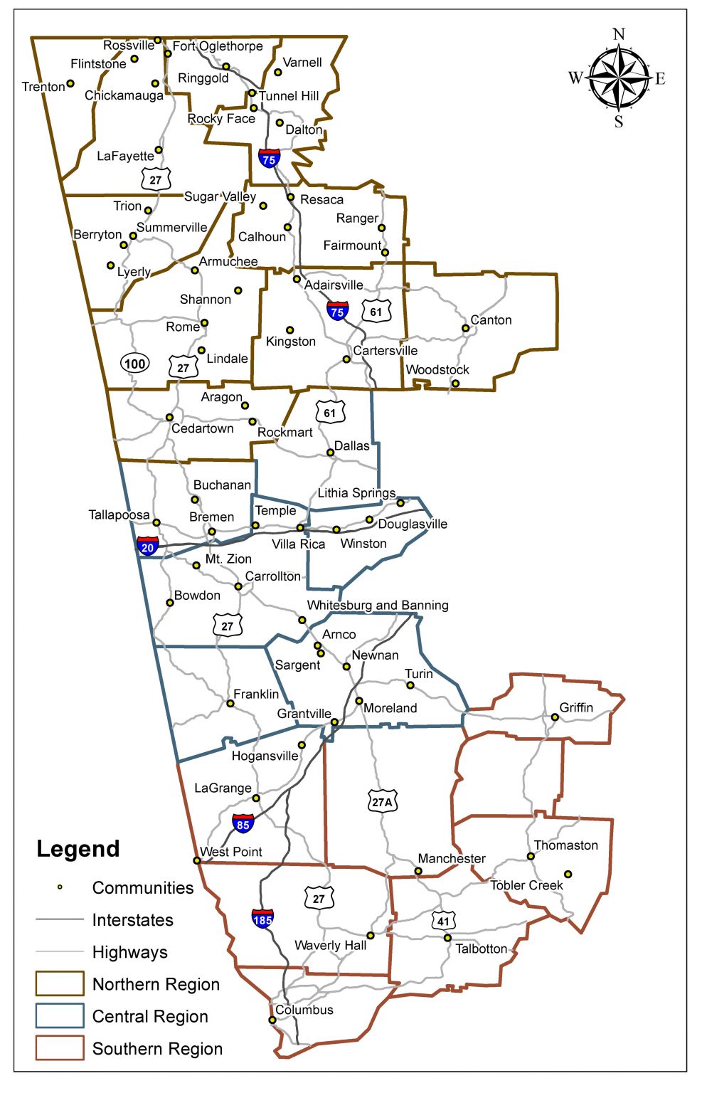
The purpose of the West Georgia Textile Heritage Trail is to tell the history of the textile industry throughout the West Georgia region while focusing on the people who worked in the industry. The maps created by Dr. Walter’s students offer a view of dimensions and changes in the West Georgia textile industry during the first decade of the 20th century. Some of the maps show the variation in the number of mills in localities, while others represent the geography of textile employment and capital investment in mills.


These two maps were created for an analysis of the capital value of textile production facilities in different towns. Each map overlays data from the Davison Blue Book on a georeferenced historic map (i.e. the students found the historic maps in digital library collections, downloaded them, and used a geospatial technique known as “georeferencing” to put the downloaded images in the same coordinate system as their other spatial data). The map above, created by Mark Hammond (Geography, 2017), reveals a stark contrast in capital concentration between large and small textile production centers in 1901, as well as the dominance of the northern region of the Textile Trail, with Columbus standing out as the giant of the southern region. Beyond what it suggests about the textile industry, this map also provides context for understanding differential patterns of urbanization occurring in the region during this era. The map below , created by Ryan Thornhill (Geography, 2017), shows the change in capital value between 1901 and 1910-11. The map shows an uneven pattern of growth and decline, with much of the decline concentrated in the smaller towns of the central region of the Textile Trail and significant growth in the relatively large towns and cities in the northern and southern regions.

This pair of maps, created by Chih Hsiao (Global Studies, 2017), compares the number of textile mills in towns on the Textile Trail in 1901 and 1910-11. They illustrate the industrialization of the region during the early twentieth century. As firms consolidated, technology improved, and the rail network connected industrial towns to the national and world economies, the number of mills grew and declined across the region. As these maps show, for example, in 1911, there were mills where there had never been before, and existing textile towns, including the city of Columbus, added even more mills. Of note, these two maps situate the Davison Blue Book data is on the 1883 Cram Railroad Map, providing a reminder of the increasingly vital importance of accessibility by rail to the textile industry at this time.
The maps below, created by Ellen Randolph (Geography, 2017), offer a comparison of the number of mills across a much larger time scale, from 1901 to 1980. While some of the 1901 pattern is evident in the 1980 map, a comparison reveals several dramatic differences, such as the relative disappearance of the textile industry (in terms of the number of mills) in Columbus and the appearance of Carrollton and Calhoun as major centers of textile production in 1980 due to technological innovations throughout the twentieth century.


The map above, created by Haley Patterson (Geography, 2018), was produced for an exploration of variation in the relationship between capital and human labor inputs in textile production. Here the map shows the number of employees per boiler (boilers provided steam power). In this map, the geographic disparity between the towns in the central region’s towns and Columbus in the southern region is much less dramatic than in the map of the number of mills per town. This map shows how GIS mapping can enhance the perspectives of the Textile Trail by making the map about the people who worked at the mills rather than about just the quantity of mills.
By incorporating GIS mapping systems into our textile trail history, we can provide a more engaging, more inclusive, and more multidisciplinary approach to educating about the textile industry in Georgia. Student work was the focus of this blog, as their creativity was evident in their interpretations of the mill industry onto maps. However, we also want to extend recognition to Dr. Walter for involving his students on this project, and for all of his assistance previously, currently, and into the future as we continue to tell the story of the Textile Trail in more innovative and interactive ways.
A special thanks goes out to all of the previous students who have worked on this project along with the Center faculty Drs. Julia Brock and Ann McCleary, and Keri Adams. This blog would not have been possible without Dr. Andy Walter and his collaborative efforts.
Great job on this. It was very good reading for an old man from LaGrange.